DeFi (decentralized finance) is a version of the financial system built directly on the blockchain: trading, lending, staking, with no bank or broker as an intermediary. The main reason people use a DeFi wallet is to explore that ecosystem through Dapps (decentralized apps) like Uniswap or Aave.
On Crypto.com's Onchain Wallet, a dedicated Dapp Browser is how users discover and access it. It's the most-used feature in the app: despite ranking only 3rd by clicks on the bottom navigation, the Dapp Browser already accounted for over 50% of all transactions, a clear signal it deserved more investment than its visibility suggested.
Problem statement
Discovery and search inside the Dapp Browser were poor, and users were losing funds to malicious Dapps, in the feature already driving over half of all in-app transactions.
My role
Product Design: audit, research synthesis & end-to-end redesign
Goal
Use the DefiLlama API integration (which automated the manual Dapp-listing process) as the moment to also fix discovery and security in the Dapp Browser, the app's entry point to DeFi.
Solution
Rebuilt the landing page around a Featured Dapps section and a more prominent Bookmarks row, reorganized filters into clearer categories with a chain selector, added autosuggest to search, and gave every Dapp a details page with a scam-list warning step ahead of it.
Impact
- 22% → 25% Dapp Browser tab click-through rate
- 28% → 33% browser search bar usage
- 4.6K → 5.6K average weekly Dapp users
- 60K → 73K average weekly Dapp transactions
The problem
User problem
- Discovery and search were poor, with no way to surface the right Dapps or find a specific one quickly
- Security was a real risk: users were interacting with malicious Dapps and losing funds
Internal problem
- Dapp listings were maintained manually, which didn't scale
- There was no way to highlight partnerships within the browsing experience
The trigger for the project was infrastructure, not UX: the team was integrating the DefiLlama API to automate the manual listing process. That change opened the door to rethinking the whole browsing experience at the same time, since interacting with Dapps sits at the core of what a DeFi wallet is for.
Research
Rather than commissioning a new study, I combined a structured audit of the existing Dapp Browser, screen by screen against the opportunity the DefiLlama integration created, with findings already surfaced through prior user interviews, plus real signal from user-submitted reports of malicious Dapp activity. The problems weren't hypothetical; they were already partially validated before the project started.
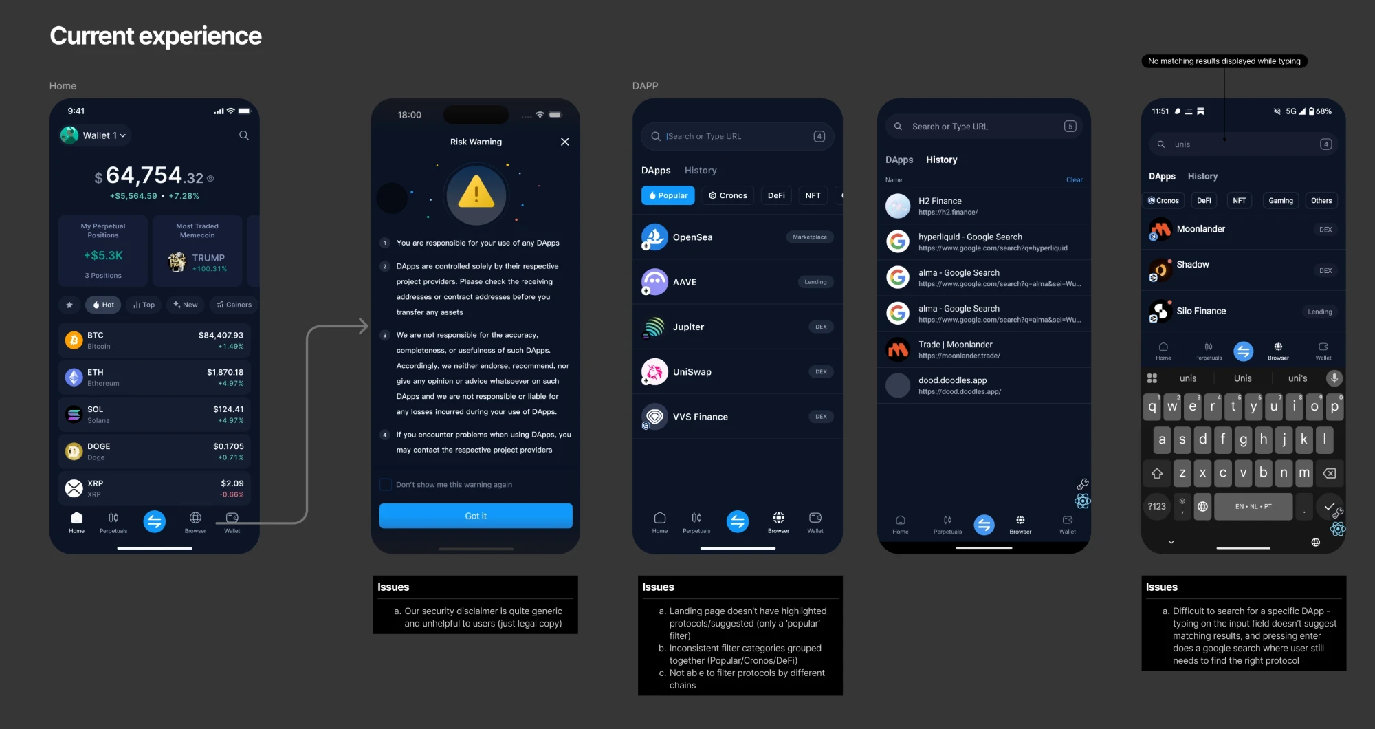
Issues clustered into three areas.
Security
- The in-app security disclaimer was generic legal copy, not genuinely useful guidance
- Tapping a Dapp took users straight into the browser with no chance to review it first
- There was no Dapp details page: no TVL, security score, or official channels to check before interacting
- Users were losing funds to malicious Dapps, confirmed through user-submitted reports
Discovery
- The landing page had no highlighted or suggested Dapps, only a generic "popular" filter
- Filter categories were inconsistently grouped (Popular, Cronos, and DeFi mixed together with no clear logic)
- There was no way to filter Dapps by chain
- Search had no autosuggest: pressing Enter triggered an external Google search instead of in-app results
Navigation
- The bottom navigation disappeared once a user moved into the browser view, forcing them to relearn navigation
- It was difficult to minimize an open browser window
Solution
Security
- Added a warning step that flags a Dapp if it appears on a third-party scam list, shown before the user can proceed
- Added a Dapp details page, giving users a place to review a Dapp's legitimacy before interacting with it
Discovery
- Rebuilt the landing page with a Featured Dapps section at the top
- Made the Bookmarks section more prominent
- Reorganized filters into clearer categories (Top Dapps, DEX, Lending, Liquid Staking) plus a network/chain filter
Navigation
Identified but not addressed in this iteration, scoped out and left on the roadmap.

Impact
The gains show up on both ends of the funnel. Click-through on the Dapp Browser tab rose from 22% to 25%, and browser search bar usage from 28% to 33%, so more people were finding and using the entry points. That interest also converted into real usage: average weekly Dapp users grew from 4.6K to 5.6K, and average weekly Dapp transactions from 60K to 73K, real growth in the feature that already carried the app's transaction volume.