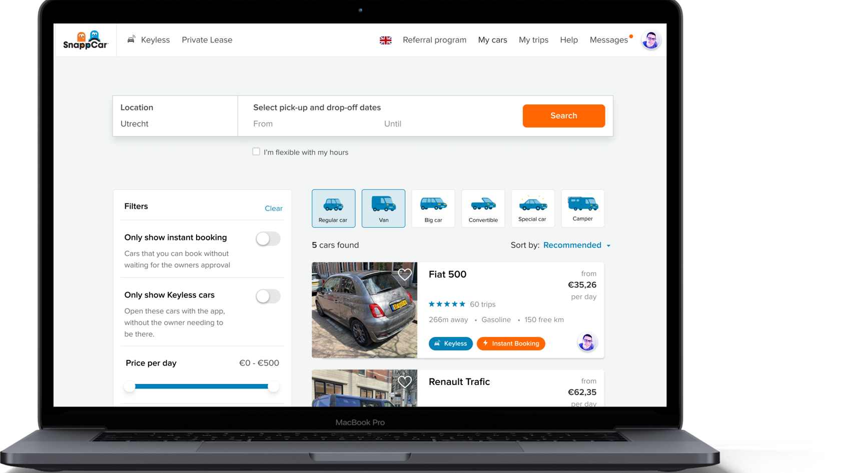
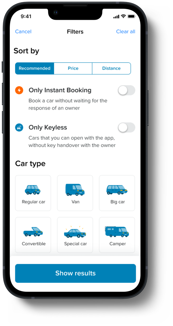
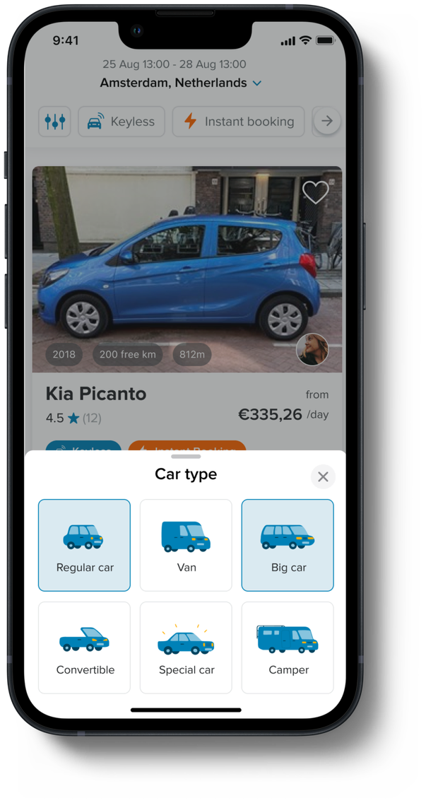
SnappCar is a car-sharing platform that brings together people that own a car and people that want to rent one. During the pandemic, SnappCar experienced a significant increase in the number of vans being added and shared through the platform. This caused the search results for specific cities to be dominated by vans, making it difficult for users to find regular cars when searching. There was a "car type" filter available, but users thought it wasn't easy to find or use.
Problem statement
Vans flooded search results during the pandemic, burying regular cars — and the existing "car type" filter was hard to find or use.
My role
UI/UX Design, User research, Illustration, Prototyping & testing
Goal
Decrease the amount of time needed to find the desired vehicle, and therefore increase conversion.
Solution
- Move the filter to a more prominent place on the page
- Reduce the number of filter options and align their names with user expectations
- Combine the filter options with illustrations to help users understand each one
Research
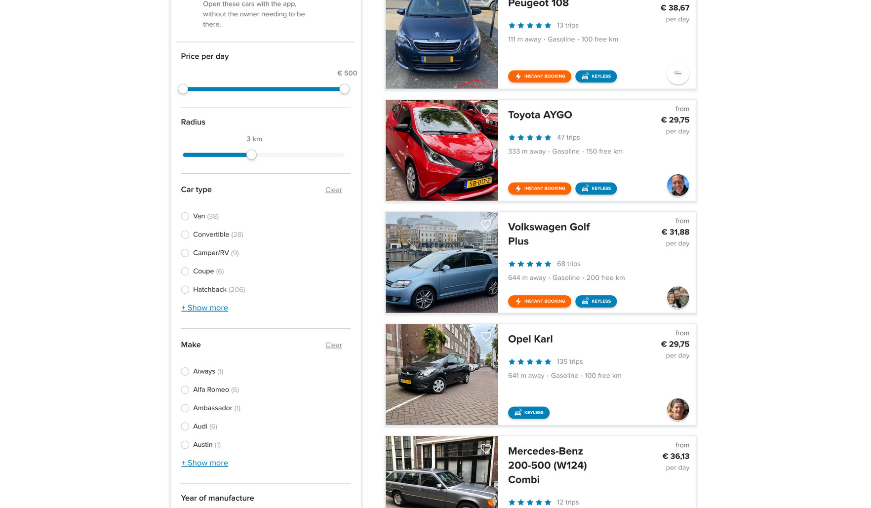
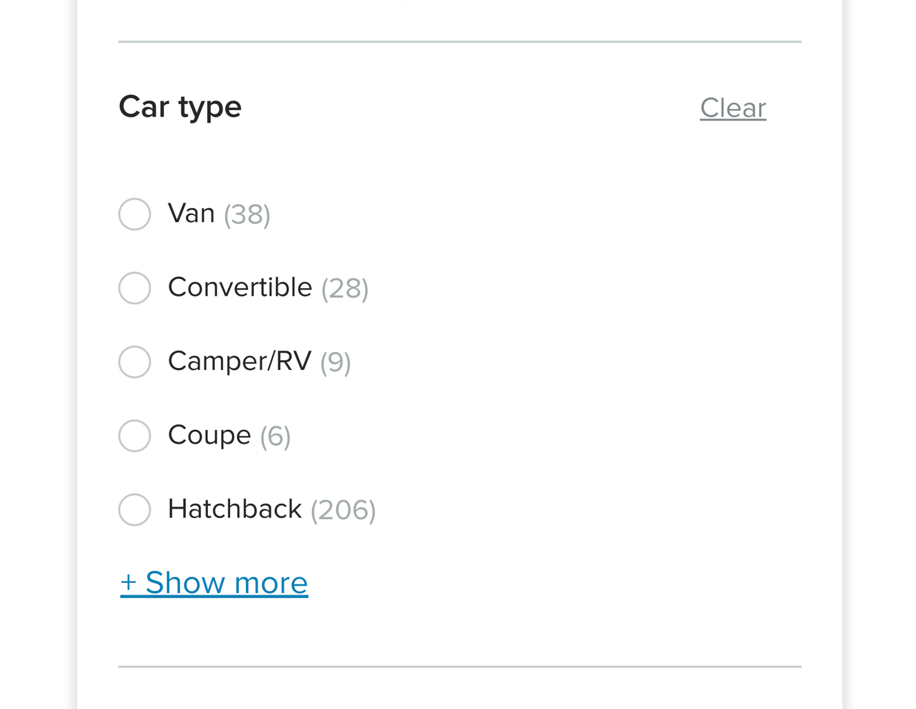
After taking a closer look at the current filter, I was curious to see what users understood from it. During quick rounds of user tests, I discovered that the main problems with the current filter were:
- Users thought the filter was difficult to find on the page
- Users didn't understand what the filter options meant (such as "hatchback", "coupé", etc.)
- There were too many filter options to choose from (11 total) and the difference between them wasn't clear
Exploration
To solve the issues uncovered during research, I defined the following actions:
- Move the filter to a more prominent place to make it easier to find
- Simplify the options of car types and match the names with the expectations of users
- Pair each car type with an illustration to make it easier to understand
I proposed moving the car type filter higher up on the screen to make it easier to find, for both the app and the website.
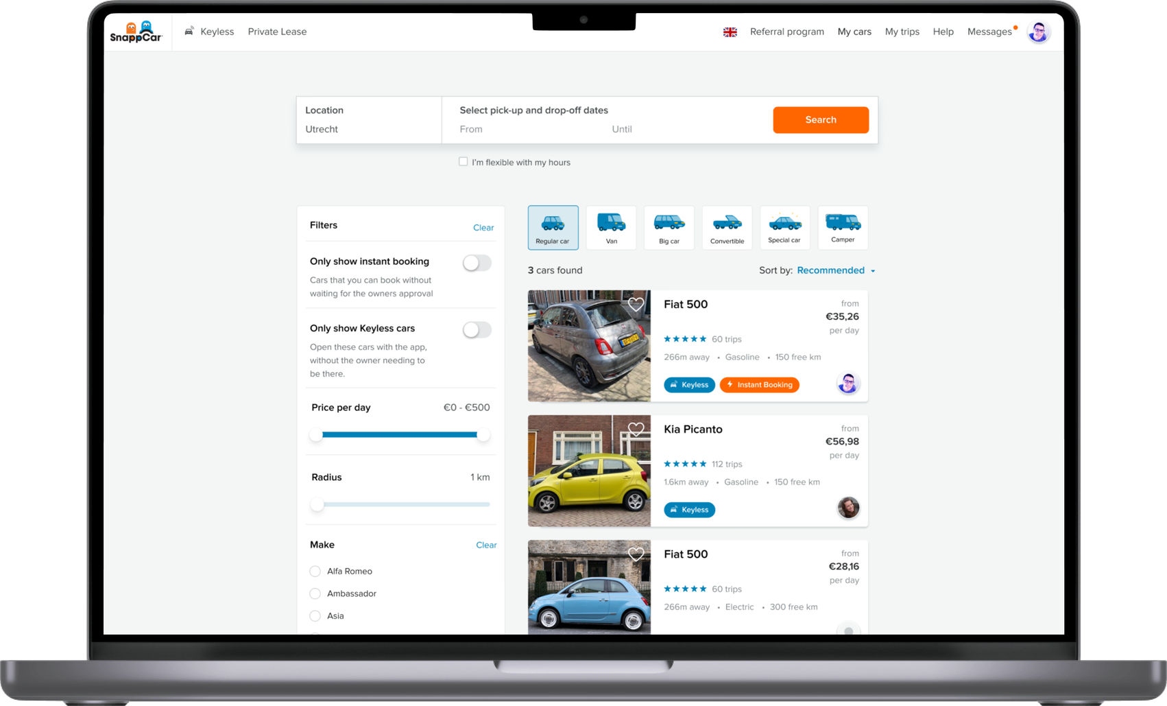
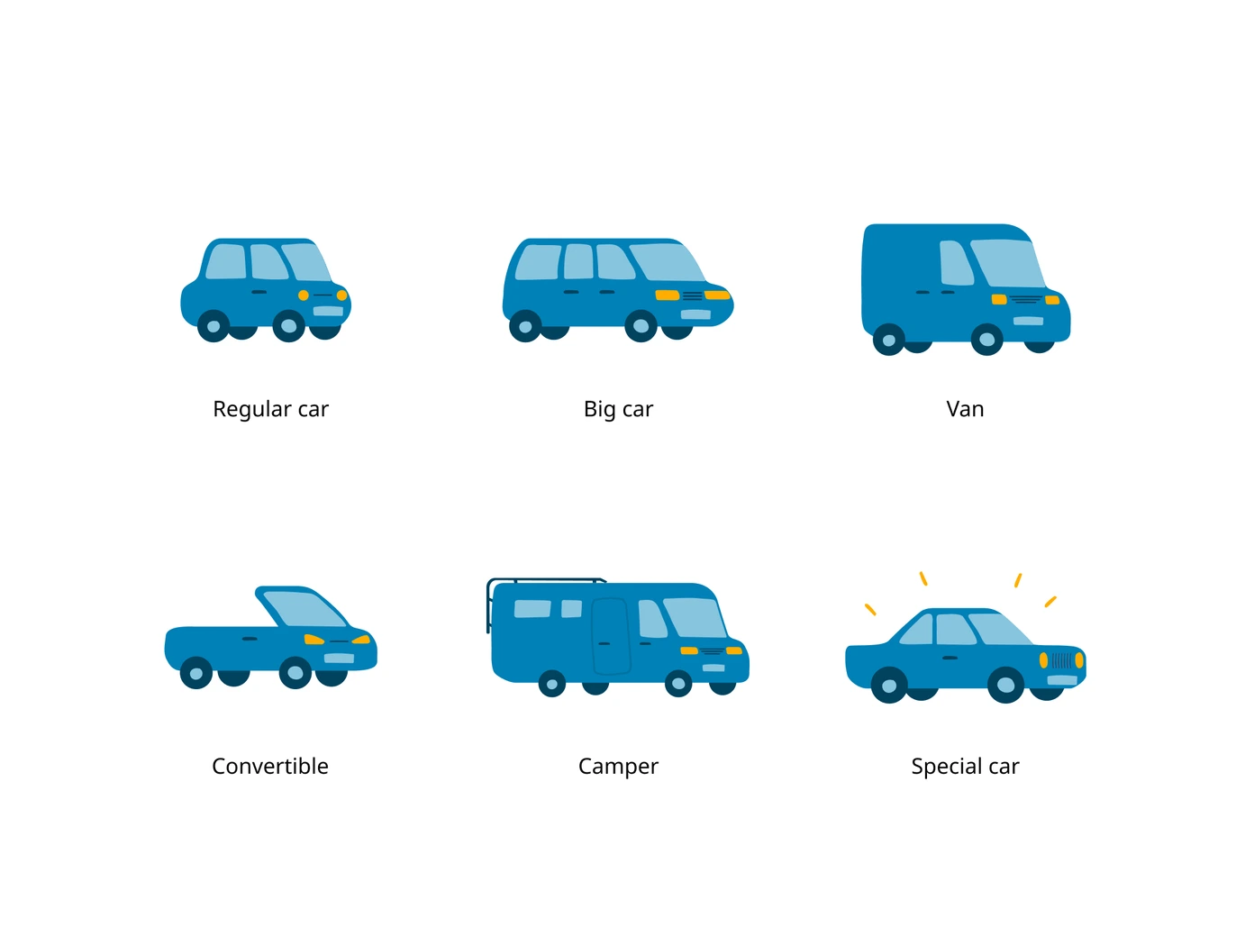
The current list of car types contained 11 items. To simplify it, we decided to stop using automotive jargon such as "hatchback" and "SUV", and group these types in a way that users understood. By using the card sorting method, I ended up with 6 car types:
- Regular car
- Big car
- Van
- Convertible
- Camper
- Special car — unique vehicles such as wedding cars, limousines, etc.
To make the meaning of each car type more explicit, I added some custom visuals — illustrating the car types in a playful manner to match the SnappCar brand.
Prototype & testing
After putting together the new car types with the illustrations, I placed the filter just above the search results. I made a prototype of the desktop solution to use for testing, and to show how the filter should behave.
During the testing sessions, participants didn't have any problems finding the filter. They said that they liked the car drawings, and that it made them want to interact with the filter — I noticed that they enjoyed playing with it just to see how the results changed.
They mentioned that it could be disappointing if certain cities don't have certain car types, and you end up with no results after interacting with the filter.
Final designs